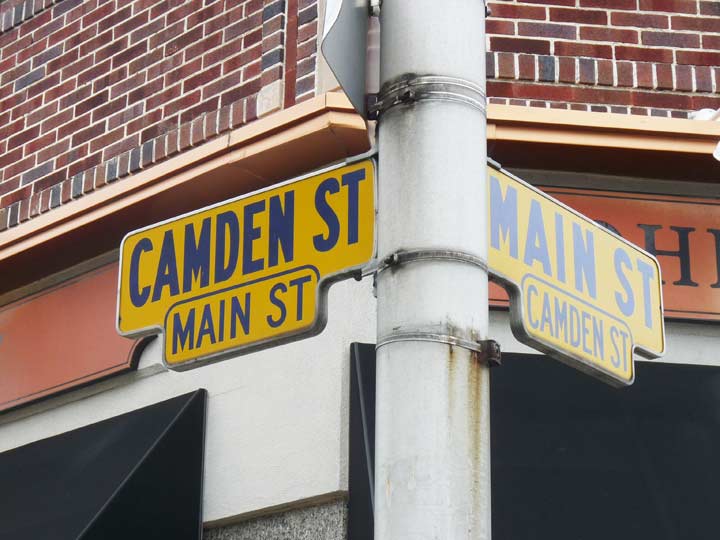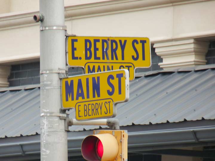
I haven’t been able to get outside NYC much… unemployment gives me the time, but not the money. However, I have ambitions of expanding Forgotten New York to include the general metropolitan area. Not having a car, I depend on the local transit network, and the NJ Transit weekend schedule on the Pascack Valley Line, which runs through Hackensack, county seat of Bergen County, is particularly parsimonious, with just one train every two hours. I was in Hackensack to visit the White Manna hamburger joint, and I had a little time to wander around Hackensack a bit. I intend to go back because I missed the domed country courthouse and the Reformed Cemetery with its ancient headstones, but I did notice the street signs.

Now, these are, without a doubt, the handsomest street signs I’ve seen in quite awhile. I have always enjoyed the black and gold color combination anyway, and these signs are still found on selected corners around town. They’re an older design–some are in better condition than others. The type font resembles and old font named Erbar (but it isn’t) while on others the lettering is in Highway Gothic. In most other parts of town you see regulation green and white and blue and white signs.
Berry Street and Berry’s Creek recall Major John Berry, a Colonial-era Deputy governor of New Jersey in the early 1700s.
Please help contribute to a new Forgotten NY website
Check out the ForgottenBook, take a look at the gift shop, and as always, “comment…as you see fit.”
9/12/18

4 comments
I agree that these signs are handsome, functional, and far better than the current upper-lower case format. The signs in the photo are similar to a design used in NYC (Manhattan only) on selected N-S avenues from around 1957 until around 1969. The NYC signs were black on yellow, equally visible due to the colors and the large font sizes similar to the Hackensack signs in the FNY post. The NYC signs appeared on 3rd, 5th, 7th above 110th, and 9th Avenues, and Broadway’s entire length. When the first generation of the standardized rectangular street signs appeared in the late 1960s, Manhattan (and Staten Island) used the black on yellow format. As most FNYers already know. Queens used blue on white, The Bronx white on blue, and Brooklyn white on black.
For the most part, the only place in Hackensack this type of sign exists is in the downtown area. I believe the type is a dark blue, not black. Many street props and even the police cars used that shade of darkblue for many decades. I remember the color scheme being used on plain street corner signs (small signs crossed at top on top of a pole) in some places. Hackensack always had some of the oldest street corner signs in Bergen County. I don’t know if it is still there, but on one of the corners along Willow Av between Main St and Summit Av, one side of the sign said “Willow Ave” and the other “Willow St.” You may want to take your next Bergen County foray on the NJT Main or Bergen Lines to Ridgewood, NJ, where the trains are more frequent. There’s plenty of varied architecture in the downtown area including the train station.
There was always a joke that you could tell you had switched towns in Bergen County when the color and style of the corner street signs (and police cars) changed. You may not have known which town you were in, but you knew you were in a different one. This still exists. Come to think of it, most of North Jersey is like this.
The Astor Place “kiosk” in it’s construction phase.( March 1986)
Sorry, link to photo didn’t work.