
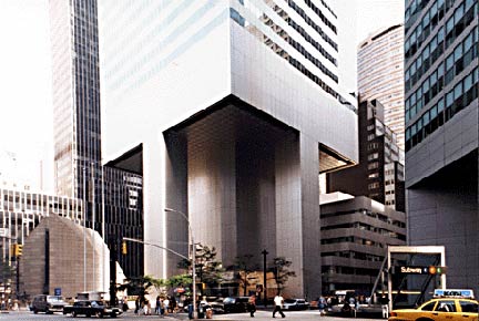
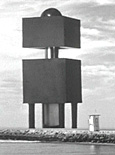
THE big bruiser at East 53rd and Lexington is the Citicorp Tower (since renamed the Citigroup Center). It was built between 1974 and 1977 and is 914 feet tall; its slanted roof, built to accommodate panels to collect solar energy, is recognizable all over town. The building takes up most of the block between Lexington Avenue, 3rd Avenue and East 53rd and 54th Streets, interrupted only by the modernist St. Peter’s Lutheran Church and 880 3rd Avenue. When designing the base, were architects Hugh Stubbins and Emery Roth & Sons inspired by the 1957 classic Kronos, Ravager of Planets?
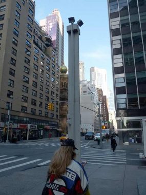
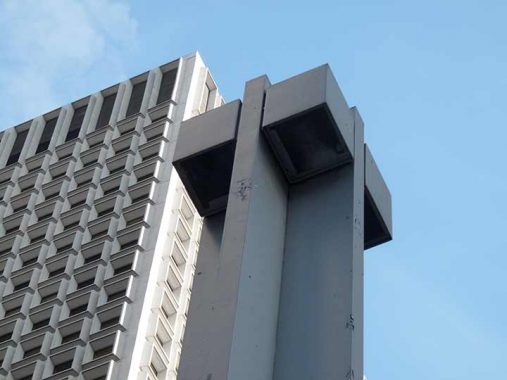
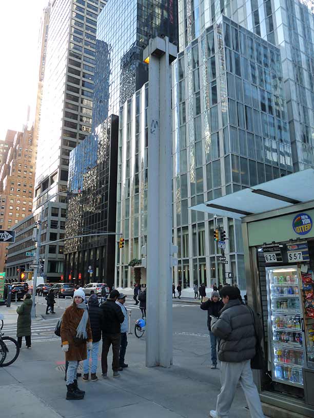
Almost from the beginning, Citicorp has always had its own set of distinctive lampposts on Lexington and East 53rd and 54th Streets. This is actually the second set of posts here, and both sets have perfectly complemented the bank’s big, bad aura. These posts also have a different design of the “walk/don’t walk” Hand and Walking Man, a somewhat squashed version that makes the Walking Man a little jauntier, with more pep in his step.
Viewed from above, the lamps resemble a plus sign, with four lamps positioned in each quadrant. Some of them have recently had additional lamps appended at the apex, which breaks up the simple design. The lamps were installed in 1978, a year after the building opened, and are the creations of the design group Designetics (which must have gone out of business, since the current Designetics is an Ohio-based water dispenser design firm). A few years ago the magazine The New Yorker called them “sculptural towers worthy of Brâncuși [Romanian sculptor Constantin Brâncuși (1876-1957) is considered a Modernist pioneer]. Indeed, these posts even trend toward the Brutalist style as they are completely unadorned except for streamlined pedestrian and traffic lights.
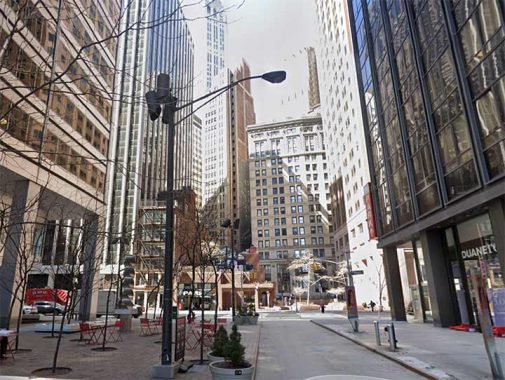
Very few buildings around town have “theme lampposts” on bordering streets. #77 Water, downtown, is another, as these double-mast posts are positioned surrounding the building on Water, Front and Gouverneur Lane. Unlike the Citigroup poles, though, they do resemble standard issue double-masts found around town.
Additional “theme poles” can be found around some bank buildings. Presumably, those banks wanted well-lit exteriors to help forestall nighttime robberies.
As always, “comment…as you see fit.” I earn a small payment when you click on any ad on the site. Take a look at the new JOBS link in the red toolbar at the top of the page on the desktop version, as I also get a small payment when you view a job via that link.
12/26/23

8 comments
It would be cool if the graffiti boys somehow made it to the top of that thing and “tagged” it
No, it wouldn’t. Vandalism like that if not repaired ASAP & not followed by an increased & proactive police presence will lead to what your new status quo is today. The Giuliani era was a welcome change because several NYPD commissioners understood & embraced Janes Q Wilson’s “broken windows” doctrine. The Giuliani & Bloomberg eras saw huge gains in public safety as a result.
BTW: My wife’s cousin was a Citicorp VP; he had a construction background & acted as a liaison between the contractors & upper Citigroup management. He later told me that it was a very successful project because it was completed ahead of schedule & without cost overruns. Rest in peace, Billy.
No,seriously though,theres something about 2/3rds the way up the lampost.Hard to make out
what it is.Maybe a transit logo “M” as in bus stop with an arrow pointing down?All the way up there
where no one will see it?Impossible!
It’s an old MTA M
Shortly after the Citicorp Tower’s completion a couple of engineering students calculated that it could topple over in strong tropical storm-force winds if the winds hit from the wrong direction. Citicorp made emergency nighttime repairs to the building over the next few months, which got little media attention because they coincided with a newspaper strike.
Within the next several weeks the ludicrously named Project Bora Bora may be the metaphorical equivalent of the tower falling over.
FYI readers:
https://www.cnbc.com/2023/11/06/citigroup-considers-deep-job-cuts-project-bora-bora.html
Happy New Year (if such a concept is possible anymore).
The whole story of the CitiCorp Tower design deficiency can be found here: https://onlineethics.org/cases/engineers-and-scientists-behaving-well/william-lemessurier-fifty-nine-story-crisis-lesson
When the building (still one of the best in the city) was new, those posts were dark bronze color and besides the lights, they incorporated the name of the building, the street names and even had small refuse bins built into the bottom portions. At some point, they have fallen victim to poor upkeep and don’t look so good these days.