People who have followed Forgotten NY over the years know by now that your webmaster is a type fanatic. I have been ever since I got involved with my college newspaper — at the beginning of each year we chose what the look of the paper would be — what fonts, or typefaces, we would use for our headlines and text. In the Super Seventies, and for decades after that, typesetting was much more a craft than it is now, when a computer makes all the typefitting adjustments with ease. By the time I entered the business, the process had simplified to a photographic process but from the Gutenberg days of the 1500s on into the late 1800s, the process of making and setting type was heavily industrial — yet called for a skilled eye and a steady hand, as small pieces of molten metal were poured into casts, hardened, stamped in ink and pressed on paper (and that’s simplifying things a great deal).
Some of our commonest everyday expressions go back to the typesetting process. Pieces of type — individual letters by different sizes and fonts — were stored in wood trays in old type shops. If they got out order, they were said to be “out of sorts.” The space between lines of copy to this day is called leading, even though small pieces of lead of various thicknesses are no longer inserted between lines of type to make these spaces bigger or smaller.
I suppose I can be nostalgic about anything. One of my first jobs out of school was as a proofreader and typesetter at Photo-Lettering, at the time the country’s biggest type dealer — the company produced advertising for the major advertising firms at the time using the thousands of fonts in its type arsenal. I worked for the better part of a decade between the hours of 5PM and 3AM, and when there was overtime, I would battle the rush hour crowds to go home. It was sometimes boring work that divided incredibly productive and feverish labor with other times when there was nothing to do, the clock moved like molasses, it would be 1AM and I wondered what I was doing there. I loved type, though, and it was only an argument with a middle manager that made me change jobs. I was doing ‘type specking’ — measuring a space required for a block of type and estimating how large or small the type should be — as a way to speed up the overnight process. In some jobs, this sort of initiative gets you promotions, but at other jobs, this is seen as usurpation and that was the case at Photo-Lettering. I was told the day manager, Bob Alonso, made it clear I wasn’t supposed to do any type specking. I phoned Alonso and explained I was trying to be of help, was met with a fusillade of curses, and I found a day job at a Russian-language typesetter (that did some work in English) a couple of weeks later. Given all that, I still miss my days at Photo-Lettering.
In 1988, when this happened, changes were afoot that would make PL and its processes irrelevant, however, as the desktop typesetting process, in which everyone is in effect their own typesetter, was on the way. PL sold of its font collection and was gone in a few years. Its creative department, though, which boasted the talents of Milton Glaser and Ed Benguiat at various times (as well as my ‘pal’ Bob Alonso, a designer himself) continued to design fonts even after the company’s demise. Photo-Lettering is still a revered name in type design and type development.
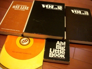
Photo-Lettering, Inc. was founded by Edward Rondthaler and Harold Horman in 1936, the partners having developed a step and repeat (a reproductive technique) for photographic lettering in Rutherford, New Jersey. Rondthaler (1905-2009) had already begun hobbying in print at age 5, and began the Big-Little Print Shop at age 13, running it from 1918-1924. Decades later, a Photo-Lettering type sample book, the Big Little Book, took its name from this long-ago enterprise.
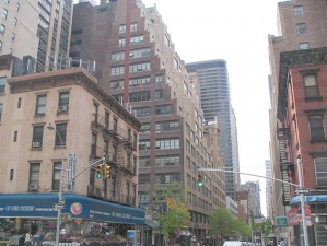
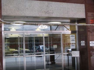
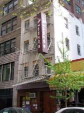
Top: East 45th Street showing the block between 2nd and 3rd Avenues. Above right, above left: Photo-Lettering’s old address at 216 East 45th, and the service entrance, which I usually used, at 226. In my six years with the company, I never noticed the classical motif above the entrance.
Rondthaler’s biography, Life With Letters, is a primer for anyone interested in typography and advertising for almost the entire 20th Century. Let him tell you the story of Photo-Lettering’s beginnings on East 45th. After convincing NYC’s largest type shop to take a look at their new photo-lettering techniques, Rondthaler and Horman made a breakthrough in 1936 …
Typo Service [short for Typographic Service Company –ed.] had, since 1928, been a part of Electrographic Corporation, and the board referred to was the Electrographic Board… Electrographic would open a new subsidiary devoted entirely to photo-lettering and called, to our delight, Photo-Lettering, Inc. It would be located at 216 west 45th Street in the building with Typo Service, but on the ninth floor where 700 feet of space was available…
At that time Electrographic had a very personable and imaginative sales manager in Stan Nowak. He pictured Photo-Lettering as a little gem strategically located in the typographic center of New York: East 45th Street from Third Avenue to beyond Second. This was home for most typographers. There were a few others spotted around elsewhere in the city but the heart of the industry was concentrated in six buildings on 45th Street built in the set-back style of the late ’20s — a style that reminds me of pictures of Bryce Canyon. The block also included some photo engravers, electrotypers, and a few printers and binders.
Nearly 50 years later, when I received weekly checks from Photo-Lettering, they still contained the words “Electrographic Corporation.” In 1969, Rondthaler, Aaron Burns and Herb Lubalin formed the International Typeface Corporation, the first type foundry to have no connection to hot metal type. It is now owned by Monotype. For several years I collected ITC’s magazine, U&LC (Upper and Lower Case) which introduced a new font or two with every issue. U&LC still maintains online archives.
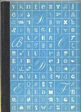
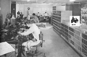
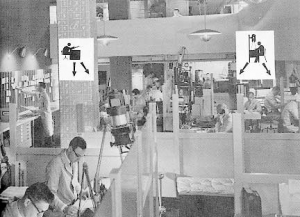
The cover of the 1981 edition of Life With Letters. It shows the letterform wallpaper that was used inside PL in the 1950s. From 1953-1966, Photo-Lettering issued a porcelain tile containing two letters of the alphabet at Christmas as keepsakes. The tiles were 5 by 5 checkerboards, each showing a different letter of the alphabet in a different one of PL’s fonts. Two letters — A and B on the first tile released — took up 4 spaces at the top left and top right. The original 1953 tile was in Wedgwood blue, same color as the book cover; the letters on the cover are the same as the ones used on the tiles. I wish I could have obtained one or two of these tiles! I do have a glass mug emblazoned with the Photo-Lettering logo that was given one Christmas, as well as a numbered Ed Benguiat poster showing different parts of letters. (Letters do have parts — serifs, finials, etc.). The two photos show Photo-Lettering in the 1950s, 30 years before I got there. Some of this elaborate equipment was still in use in 1982 when I arrived. Part of my job was type ‘specking’; the two guys on bottom left in the 2nd picture are doing that, using a pica ruler, no doubt.
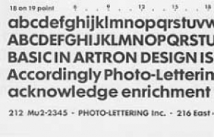
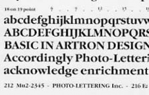
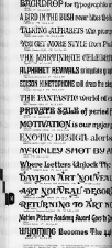
LEFT: sample page, PL’s One Line type book; above, Futura Maxi Bold and Garamond Maxi Bold, Artron type sample book. Both from early 1980s.
All of Photo-Lettering’s fonts were numbered from 0000 to 9999. If a client needed type for a display, or typeset for an ad, all (s)he had to do was call in and request the font by number. Where typefitting was required, there were about 6 or seven guys and gals who took orders by phone and ‘specked’ them to fit on ad layouts that were penciled on see-though paper. They usually worked till about 11PM, and then the rest of us typeset and then proofread the ads to order till the ends of our shifts, usually ending at 3-5AM. (For years, I would catch the #4 at Grand Central at 3:15AM.)
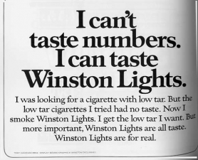
I worked in the Artron, or text typesetting, division. We used fonts generally not used today; in the 1980s, ITC was nuts about creating typefonts with unusually high x-heights (the small letters were almost as big as the capitals). This fell out of favor in the 1990s and typography has returned to a more classic look.
ABOVE: Classic 1970s-1980s style type, with high x-heights and “TNT” (tight-not-touching”) kerning. It’s not shown here but Photo-Lettering could do what no other typographer, before or since, could do: hang punc., meaning that the hyphens or commas on justified type would “hang” into the right margin. Also seen nowhere else, and this was nifty: underscores could be interrupted for lower-case descenders. We wrapped type around art, but in the Easy Eighties, we had to enter incredibly complicated lines of code on our terminals to do it.
RIGHT: PL’s periodic publication PLINC was distributed to clients and that’s where PL opened the throttle a little and presented complicated layouts and typesetting. Note the specialty digraphs on the double O and HE (top) and the ET. Don’t get me started on typographic digraphs!
And Ed Rondthaler? Began his own type shop in 1918… started Photo-Lettering in 1936 and helped form ITC in 1969? Still going strong — did a Pearle contact lens TV commercial at age 102 and this video about his longtime pet project of reforming English spelling.
August 2009: Rondthaler passes away at 104 — eulogized by Yves Peters in Fontfeed Magazine.
Photo-Lettering Environs
While working nights at PL I didn’t get out very much — down the block or around the corner for some fast food for lunch, which I generally ate at 2AM. (I would hit the sack as soon as I got home, between 5 and 7AM depending on my shift, and would wake up around 1PM, putter around for a few hours, and commute against the grain to work between 5 and 7PM. When first hired, though, I did days for awhile, walked around, and noted some aspects of the immediate neighborhood that formed lasting impressions.
Meet Me At The Dag
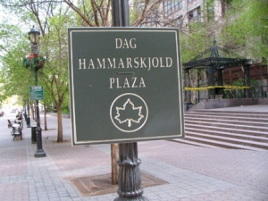
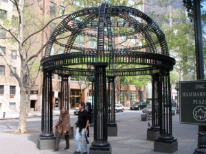
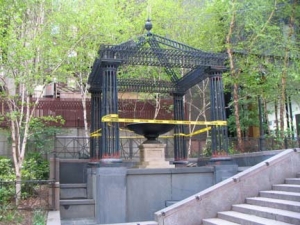
Dag Hammarskjöld Plaza runs from 2nd Avenue east to 1st Avenue at East 47th Street, constructed by the NYC Parks department shortly after the UN opened on 1st Avenue in stages between 1947-1953. Mostly a concrete plaza with benches, it was named for the second UN Secretary-General, Sweden’s prime minister Hammarskjöld (1905-1961), and re-landscaped with decorative metal structures and new benches in 1997-1999. Unfortunately the direct view the park had of the famed Long Island City Pepsi-Cola sign is no longer possible after the sign was moved, though you can still see the Zurab Tsereteli statue of St. George slaying the dragon at the very end of the plaza at 1st Avenue (see FNY’s 12 Horsepeople of the Metropolis page).
Holy Family Church
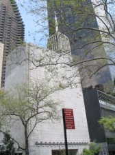
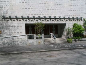
The 1964 Holy Family Church (315 East 47th facing the plaza) with its white marble exterior, reminds me a great deal of Edward Durell Stone’s 2 Columbus Circle, remodeled in a controversial re-boot in 2007. (The spoon-shaped decorations that gave it the nickname “Lollipop Building” were removed during the remake).
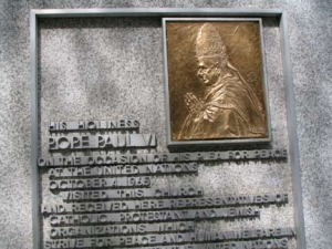
The church was new when it was visited by Pope Paul VI during his NYC tour in the fall of 1965. The pontiff visited the UN, the 1964-5 World’s Fair, and the ex-Cardinal said Mass before thousands at Yankee Stadium. It was the first time a sitting Pope had ever visited the USA.
The church is backdropped by the 72-story 2001 Trump World Tower (Costas Kondylis, architect). Has “the Donald” ever built an esthetically pleasing building? All of them seem to be about height and imposing power. For about one year, 2001-2002, it was the world’s tallest residential building until surpassed by Tower Palace Three Building G in Seoul, South Korea.
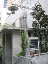
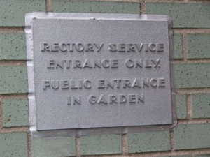
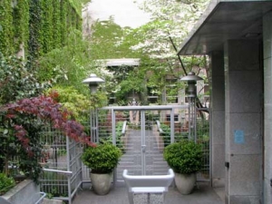
Holy Family Church has retained many of its 1964 features, including typography on signage, modernist lamppost design, and charming prayer garden.
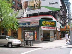
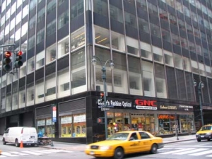
2nd Avenue and East 45th. The now-shuttered Alonzo’s, in the 1980s called Monks, was the after work pub of choice for PLers, but I was rarely there, getting out between 3 and 5AM. Every Thursday night at about 2AM, I ate my lunch at this Blimpie’s on the corner. Though Blimpie’s has lost its city-wide battle for hegemony to Subway, Blimpie sandwiches are demonstrably better: the ingredients are piled on thicker and the bread (when fresh) is much softer. The famed Palm steak restaurant is across the street, but Blimpie’s is more my price range.
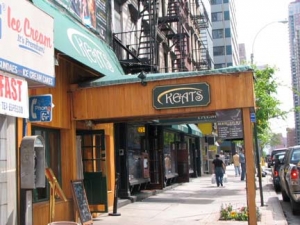
LEFT: West side 2nd Avenue between East 45th and 46th. The Dag Hammarskjöld 47-story residential tower looms in the background. RIGHT: In the 80s as now, Keats, named for the English Romantic poet John Keats (1795-1821). You may have read his Ode on a Grecian Urn in high school.
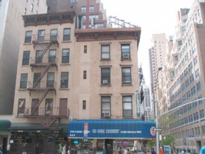
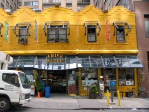
These 4 and 3-story buildings on the SW corner 2nd Avenue and East 45th are anachronisms on east side avenues, which are gradually filling with tall towers. RIGHT: this small brick building at 240 East 45th has been painted gold since my days on the block, and now houses an Amish Market. I must admit, I have never gotten anything when I have been in an Amish Market or Trader Joe’s — don’t recognize the brands!
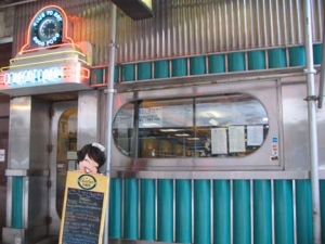
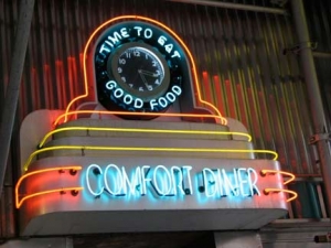
I never (or rarely) ate at the Comfort Diner — in the 1980s called the Jay Dee Coffee Shop — while working at Photo-Lettering, though at 214, Jay Dee was right next to PL at 216. It had “normal” hours and was closed when I went to lunch. I never thought to try it before work, though, and I can’t remember if it had any of those classic diner trappings back then. These may be add-ons, because Jay Dee doesn’t show up on any of my NYC diner sources. This is the only Comfort Diner in operation at present — the West 23rd Street Comfort, just west of 5th Avenue, shut down in early 2009.
More Memories
What else do I recall from that period… a) we had slanted desks to work on when specking or proofreading and when there was “downtime” I would take pieces of paper and draw imaginary maps of imaginary cities (I’m not a doodler). I would frame them and distribute to family members…one of them is hanging in my bathroom. I should track down the other ones, or make new ones, but I’d have to buy a drafter’s table. b) another PL innovation: our prints appeared in glassine on the final proof, making it easy for layout staff and drafters, especially when a correction had to be stripped in. You could also place one proof atop the previous proof to check if your fix was done, or if it was re-ragged. c) one year, management offered us an extra week vacation the following year if we didn’t take any sick days the current year. Fortunately I never got real sick all year, and earned my extra week.
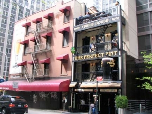
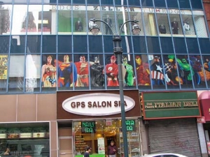
As I seem to remember it, the 696 Deli on 3rd Avenue was once known as Smiler’s. It’s still got its old neon sign, and seems increasingly anachronistic on 3rd Avenue, which has seen more high-rises since the Photo-Lettering era. RIGHT: the Perfect Pint on East 45th just east from 3rd used to be newsie hangout the Pen & Pencil steak house. Hunsecker/Winchell-esque columnist (though nicer) Earl Wilson once held forth from there. That’s Earl, brother.
Sparks, the steakhouse where Gambino crime family boss Paul Castellano was killed in a power play by John Gotti’s associates on December 16, 1985, is around the corner, at 210 East 46th Street.
My friend Gary, who has since moved to Atlanta, worked across the street from me for a time during my PL employment. Of course he worked daytime hours, but at times we would meet at this Blarney Stone on 3rd between 44th and 45th for a few, him after work, me before. Did I ever go to work with a buzz? Maybe, sometimes, very occasionally. The Blarney Stone chain of dives has been around in NYC for decades, and yet I don’t know much about them. Can anyone fill me in? The chain is named for Ireland’s namesake stone, located at Blarney Castle outside Cork. According to legend, kissing it gives the kisser prodigious persuasive powers.
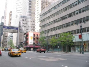
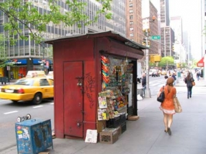
The two little brick buildings at 3rd and 45th are being quickly overshadowed by office and residential towers, as demonstrated photo left. RIGHT: one of the few non-CEMUSA newsstands left at 3rd and East 46th.
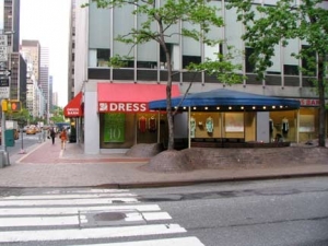
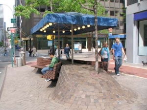
The Dress Barn at 3rd and East 46th is a former location of the Sam Flax chain of art and drafting supplies. I would come in for pens, pica gauges, that kind of thing. I love drafting shops and still frequent the Flax on West 20th Street in Ladies’ Mile. RIGHT: 747 3rd, between East 46th and 47th, has these unusual sidewalk “humps” supporting park benches. Few developers encourage people to loiter outside, but these ‘humps’ and benches have been here for many years. The building rose in 1972.
Jim Naureckas, in NY Songlines: As with 777 and 767 above, the developer for this 37-story building was Mel Kaufman–“the city’s greatest pioneer for creating a humane, interesting, surprising public environment” (City Review). This 1972 Emery Roth-designed building–which houses the New York bureau of the Canadian Broadcasting Company and the Australian Broadcasting Company–features an undulating sidewalk, exposed ductwork reminiscent of the film Brazil, and a sculpture of a nude woman that can be glimpsed between the revolving doors.
Corner (of East 46th): This was the site of the U.S. Provost Marshal’s Office, where on July 11, 1863, a Civil War draft lottery was started. Two days later the building was burnt down, sparking the Draft Riots, the bloodiest unrest in New York’s history.
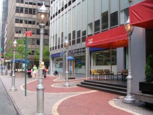
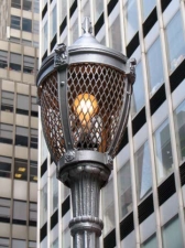
As long as I can remember, the 747 front entrance has been protected by four Type A Henry Bacon park lights, painted silver.
The nude lady, I didn’t see, though, which perhaps tells you about my priorities.
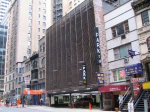
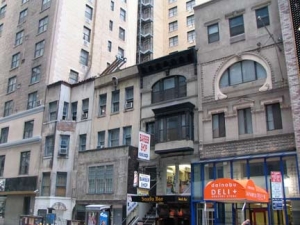
If you want to get a better idea of what Manhattan looked like decades ago, check the buildings on the side streets — especially in Midtown, where nothing stays the same for long, it seems. Here on East 47th are a number of buildings that appear to be from 1900-1920 or thereabouts. The string is interrupted by one of the ugliest parking garages you’ll ever see, though I’ve never seen an attractive one. Between 3rd and Lexington.
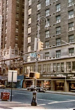
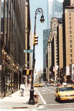
When I first started working in the area in the 1980s I couldn’t help but notice this Type 24A-W Bishop’s Crook at the NW corner of Lexington and West 47th, It was one of a pair of latterday Type 24A-Ws on Lex (see below for the other one). The pole was replaced by a 34th Street Partnership post (left) in the mid-1990s. vintage photos: Bob Mulero
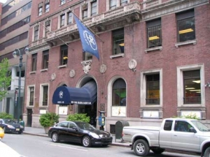
Midtown Comics, 45th and Lexington. It wasn’t there in the 1980s– my comic store was Forbidden Planet, then at 12th and Broadway. I would arrive once a month on Friday about 3 or 4 PM, browse as long as necessary, get what I wanted, and then head for supper, then to work and hope it wouldn’t be too busy on Friday night. Sometimes I would go to a place on East 57th near 2nd Avenue, but that was only rarely; that store isn’t there anymore. RIGHT: NY Health and Racquet Club, East 45th east of Lexington. The building really looks like it used to be a hotel, though I don’t know which.
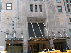
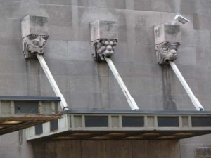
In the wee hours each morning I would pass the Greybar Building, Lexington Avenue between East 43rd and 44th, with an entrance in Grand Central Terminal. (The terminal closes overnight, so I would use the IRT entrance at 42nd Street to enter the station).
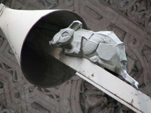
Strange creatures spit out hawsers supporting the canopies protecting people waiting for cabs either side of the main entrance. The hawsers on the main entrance feature rats scrambling on them; the hawsers were meant to evoke a maritime theme, and rats were always trying to board ships in this manner in the days of wind-powered sailing.
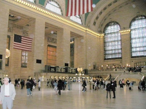
Sometimes on the way to work I would pass through the waiting room at Grand Central, tied for NYC’s greatest public space with Rockefeller Center. This was before the Big Cleanup, and the dust and grime on the windows was too thick to allow sunlight.
Soon after my dustup with Bob Alonso I consulted an agent named Al Smith on 42nd Street, a nice guy who found me work with ANY Phototype, a mainly Russian language type shop on 29th Street ran by 3 proprietors, 2 brothers (initialed A and N) and Yuri Stark. They needed someone to work with English and other languages using the Roman alphabet. I typeset and read work in English, French, German, and even the Swiss dialect called Romansch. I don’t know any other language than English, so I worked character by character. This got me through the next three years before an inevitable economic downturn meant a layoff. That was 1991. Since that time I have worked with the world’s biggest direct marketer and the world’s biggest store since, as well as a 13-year part-time stint with a chain of local Queens papers. And, of course, FNY the past 10 years.
UPDATE: in 2018, I worked for 6 weeks at a financial publisher at 216 East 45th!
Any old Photo-Letterers in the house? Let me know.









16 comments
I found your article on Photo Lettering in a google search. I have an “artifact” from there that you may be interested in. Please forgive the unsolicited offer, but I have had this thing for a long time, and though I have always been fascinated with it, I suspect you would want it more. So, have a look at these pictures and let me know what you think.
https://dl.dropboxusercontent.com/u/65762317/PL/PL_ruler_1.jpg
https://dl.dropboxusercontent.com/u/65762317/PL/PL_ruler_2.jpg
https://dl.dropboxusercontent.com/u/65762317/PL/PL_ruler_3.jpg
As you can see it’s not perfect, with a litttle bend in one end, but really nice.
How do you feel about $20 for this fine bit of memorabilia, including shipping? I have a paypal account (this email) that you can use.
yikes! Did you get my prior message? It seemed to disapear without warning.
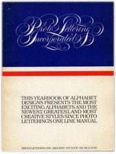
Just curious, are you selling any of the books shown above?
I’m hanging onto them for now
HI Kevin!
I remember you when you proof read with Joe Orenstein and Dave Crupnik.
I worked in the VIP room with John Rose in 81 and 82. Tall kid if you remember me.
Hope all is well.
Hey kevin, hey big bob!!! Long time no see!!!!! I was dredging up some old memories and found this article and I knew it had to be someone I worked with.
Bob, Jon and I had been friends since we were in high school sadly he passed away back in 2001.
Good to know some of us are still around!!!!!
I still have the book, the poster and a little cup thingy they gave us too.
Dave Crupnick-former VIP tender/Proofreader PLINC.
My grandfather worked at Photo Lettering and I have a few of those tiles! I’ll have to find them, now.
I’ve had an interest in fonts for 40+ years, in part due to the Albany newspapers. I had to do some letter setting in the 1980s for a college project that involved redesigning a newspaper. Since the advent of computers, I have been gathering fonts. While I did not work with Photo-Lettering directly, I’m sure I had some contact with them indirectly.
I was an employee at Photolettering back in the mid 1980’s along with my great friend Jerome Kresch,
Jerry and I worked 2nd shift. Knew Bob Alonso. What a great place.
I was a messenger at photolettering 81 to late 82 ,I walked all over that area. Thanks for bringing back memories.
I worked at 240 East 45th St when it was a post production facility called Tulchin Studios in 1982.
I also worked at 216 East 45th at the Tape House Editorial Company on the night shift in 1984.
I worked for Typographic Service (TS), Sol Malkoll was the head guy then, not sure of the years, probably around 1968 or so, TS was the class in the industry…….
Thanks for the memories…….
I worked at Photolettering from about ’76 to ’81 first in the editing dept. then sales service. They were downstairs then moved to 2nd (?) floor. I always loved type but PL taught me to respect the work and care that went into the type design process which was all drawn by hand, painstakingly perfected, then transferred to film. The people (men, at that time) who designed the typefaces were highly revered. Bob Alonzo was my boss. I think he was the day general manager of the shop. I always got along with him. when I first started working there, he would critique my headline spacing–said “you can drive a truck through that.”
I didn’t have much luck with Bob. I remember that phrase.
Hoping that this site and this story about Photo-Lettering is still being monitored. I started my design career in NYC in 1972 as a junior Art Director in a small studio located just off 3rd Ave on East 56th. We used Photo-Lettering often – and I still have my PL One Line reference manual at arm’s reach in my California studio today. Would love to connect with you Kevin!
I still have all the type books–