
NOW HEAR THIS: the subway/MTA photo ban lives.
Snapped a photo of a track indicator at Flatbush LIRR. With the renovations going on, these may soon vanish.
Two cops rush over. One says, ‘tell me you didn’t just snap a photo.’ Demands camera, ID. Compels me to erase photo of track indicator and one of Morris Park, Bronx, taken yesterday (no matter: I have that on film at the developer). The cop was incredulous that I would photograph in the system. Police are trained to investigate suspicious behavior, and part and parcel of the philosophy is that photographers are automatically suspect. Why would anyone take photos at train stations, is the thinking.
Since I was not ticketed or arrested, I did not ask for his badge number; besides, I was not confident I would win if I brought suit.
If there is a photo ban at transit facilities, it should be posted in clear sight. I have contacted the MTA to clarify things, and will also try the CCRB. Will the MTA chicken out, or give me an answer? Any cops out there want to weigh in off the record?
In the meantime, here’s a bunch of shots I got on the trains while sneaking around the coppers, with a special look at subway design, lighting and art…
Early mosaics
(Click on the subway letter or number for a detailed description of the station from nycsubway.org)
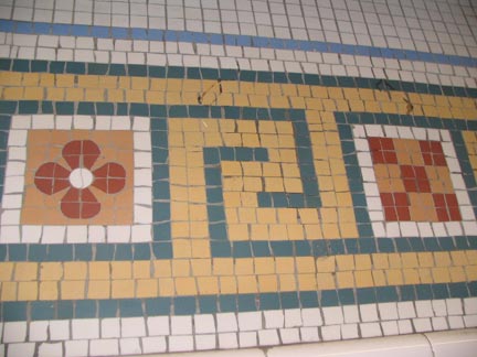
The subway’s very first decorative mosaics were in the second wave of Heins and LaFarge-built stations, constructed in 1908. Unlike later BMT and IRT mosaics they lay flat against the wall and are not raised.
ABOVE: from waiting area adjacent to the elevators at 181st Street.
From station walls at East 149th Street in the Bronx, formerly known as Mott Avenue; one “Mott Avenue” mosaic plate still survives here.


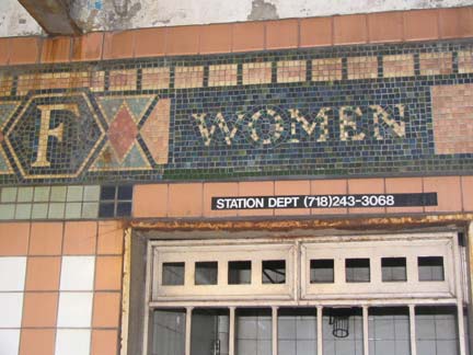
Women’s room sign and stylized “F” from Franklin Street station, Seventh Avenue IRT
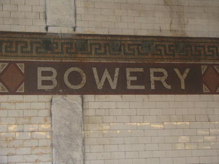
Very early BMT mosaic “Bowery” sign with mosaic diamonds. This station on the Nassau Street-Broadway (Brooklyn)-Fulton Street-Jamaica Line is one of the least frequented in the system; it opened in 1913.
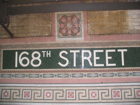
At 168th Street, Heins and LaFarge showed off their early mosaic prowess with blue, pink and brown highlights on the station nameplate.
168th, built in a deep tunnel (8 stories deep) as are the IRT 181st and 191st stations, is a marvel of early subway and design innovation.


The station is so deep it is only accessible via elevator both from the street and the mezzanine of an intersecting IND line built 30 years after this station opened. An elevated walkway over the tracks allows transfer from uptown to downtown. This station lighting is unique to 168th Street, and while this isn’t the station’s original lighting fixtures (spaces for chandelier-type fixtures on the roof testify to that) this lighting is plenty retro-cool.
Later mosaics
When artist/architect Squire Vickers took over the subways’ art direction with the BMT Dual Contracts of the 1910s, he also later assumed the post with the IND. Most subway artwork from the 1910s through the 1930s is attributable to his efforts; NYC’s subways have a richness in station decoration that is vastly superior to any other system in North America. The process is still ongoing, with the MTA’s Arts in Transit program continuing to beautify stations today.
The renowned ceramic tile firms of the early 20th Century were employed to create ID and directional signs in the subway: Rookwood Pottery, Grueby Faience, and Atlantic Terra Cotta.
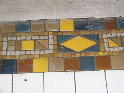
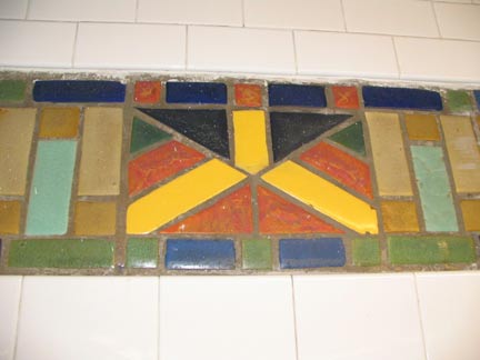
BMT 14th Street. Vickers used a varied palette and raised, glazed ceramic tiles cut in squares, triangles and rectangles. They reflect the Arts and Crafts movement of the early 20th Century.
IRT 5th AVENUE. Opened 1917. Here Vickers limited the palette to light brown, dark brown, and very occasional gold to liven it up a little. Later, on the BMT Canarsie line, the last line to be built before the streamlined, Machine Age IND began construction, he used every conceivable color.
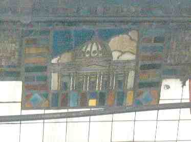
BMT Court Street. Vickers often decorated stations by depicting present or former landmarks, even those razed before the subways were built. This is the Kings County Courthouse, no longer there.
IRT Gun Hill Road. Direction signs were not to be overlooked. Even a small sign pointing to the downtown train is done in rich blue specked with black. On el stations like this, this was one of the few opportunities to use mosaics.
IRT Main Street. Opened January 1928. Lee Stookey, in Subway Ceramics, says that the very stylized mosaic here represents the St. George Episcopal Church, which has been on Main Street since the 1850s, with other mosaics in the station depicting the Friends Meetinghouse (see Tour 21) and the John Bowne House. I’m not sure I buy that theory, but I’d like it if it was the truth.


23rd Street Lexington IRT. We’ve seen the bigger station ID tablets, but let’s have a hand for the finely crafted smaller ID signs. Many of the IRT and IND stations carry small numbers surrounded by their own colored ceramic frames. The station columns that are under buildings are reinforced and have tile on their exteriors. These also have identifying enamel plates, or in this case, meticulously handpainted numbers. This number conforms to the tenets of typography: note how the bowl of the “3′ dips slightly below the baseline. If it were not done, an optical illusion would make the 3 appear smaller.
The IND
 161st Street IND. With the 1930s came a more streamlined approach with uni-colored station tile and big, bold sanserif station signs. The typefont used in these stations is unique to the system and I’ve never seen it duplicated elsewhere. The IND was the polar opposite of whimsical; humorless may be the more apt term, but Vito Acconci’s Arts for Transit work, Wall-Slide, slices and dices the Machine Age concept, standing it on its head quite literally. Elsewhere in the station, color is substituted for what would ordinarily be white and vice versa.
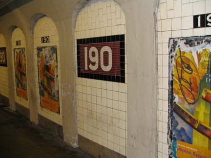
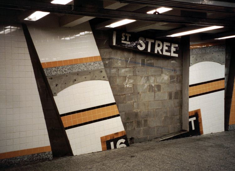
There isn’t a lot to differentiate IND stations except color, but here at 190th Street, drilled through bedrock, reinforcing arches forced Vickers to adjust. Here, just the station number appears without “STREET” spelled out.
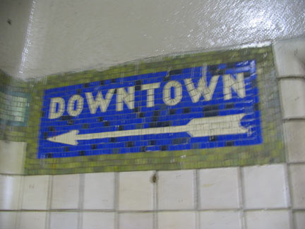
Telling you where to go
The unsung heroes of subway platforms are the signs that tell you where to get off, or what street you’ll be on when you do leave.
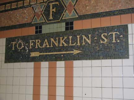
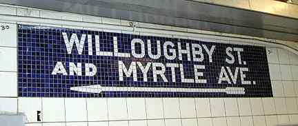
There are two of these at Franklin Street, one set pointing to Franklin and one set pointing to North Moore Street.
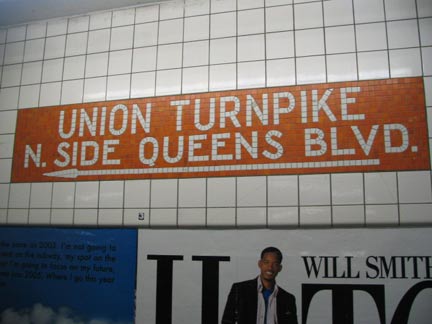
This sign points to the exit from the unusual dual mezzanine at the IND Union Turnpike station.
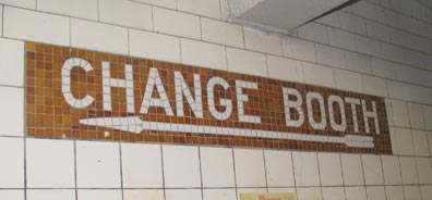
This one at northbound East 182-183 Street on the IND Grand Concourse line is a real find, since it predates the era of tokens (which began in 1954) and directs patrons to the change booth clerk. Directional signs like this in the IND were generally light brown or orange, despite the otherwise prevailing color in the station.
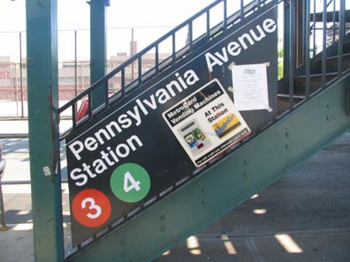
Though signage on el staircase handrails was formerly quite common, it’s rare in the modern era, except for this item at Pennsylvania Avenue on the IRT New Lots.
Jay Street IND station, the only place in the subway system where you can cross a platform between the IND A (and C) and F lines.
Stillwell runs deep
FNY has closely, er, “tracked” progress at the BMT’s Stillwell Avenue terminal, both when it was decrepit and when it was rebuilt (featured on the Mermaid Parade 2004 page). Here, let’s take a look at its newly-opened entrance and mezzanine.


Stillwell Avenue terminal is where most BMT lines end, or begin, depending on your POV… namely, the D (West End), F (Culver), N (Sea Beach) and Q (Brighton). The station was first built in 1920 and until recently, had become a literal cesspool. But the MTA has rebuilt it and it has risen from the pit.
Above left, we see the unusual line indicator. It’s likely the MTA is harking back to an old Coney Island ride or symbol, but I’m not sure what. To me it resembles a stylized octopus. RIGHT, the new facade. Recognize the BMT signs? You should…
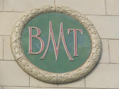
…because the MTA removed the pale green ‘BMT LINES’ and ‘BMT’ signs from the old facade, removed the cracks, and restored them to their old position.
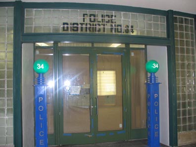
The station has a police precinct ready to bust any rail photographers.
Captured by the BMT


Cortelyou Road, BMT. stations along the old Brooklyn, Flatbush, and Coney Island Railroad (which evolved into the Franklin Shuttle and the Brighton Line, now the Brighton Line, or Q train) still retain many aspects of their old railroading days.
The Brighton has an incredibly complicated history. Along with the IRT #5’s Dyre Avenue Line, it is a subway line that has been adapted from an old railroad line (a practice that could today be used to adapt the LIRR’s old Rockaway Line in Rego Park and Woodhaven and the little-used western end of the Montauk Branch in Glendale and Maspeth). But NYC transit has been out of the business of adapting unused rail lines for some time.
From a design standpoint, the Brighton’s Prospect Park, Parkside, Beverley Road and Cortelyou Road stations all feature waiting rooms/fare control areas that overlook the tracks, which is unusual in the system. Most of them were redone in the late 1980s with new tiles, lighting, art and fixtures. And, for typography buffs, Parkside, Beverly and Cortelyou are the only stations in the system that employ the Times Roman font on the ID panels. The font was developed for the Times of London around 1930 and is the most popular text font in the world today.
Sign of the Times


Times Square, the Manhattan terminal of the IRT Flushing (#7) line, boasts several brown and sea-green mosaic station signs that the MTA has done its best to obscure. There’s an even older one that’s definitely endangered here too.


Tom Otterness has become NYC’s go-to sculptor. His miniature bronzes are all over the 14th Street station where the IND 8th Avenue and BMT Canarsie Lines intersect. His installation here is called Life Underground. Otterness’ work can also be found at Brooklyn’s Metrotech, Battery Park City and Roosevelt Island. In 2005, he has a balloon in Macy’s Thanksgiving Day parade.
If you like the ear, here’s some eyes.
ABOVE RIGHT: it’s appropriate that at the IRT Flushing Main Street terminal, NYC’s second-largest Asian-American enclave, that station decorationbe commissioned to a Korean artist, Ik-Joong Kang, whose Happy World adorns the wall above the platforms at the station’s eastern end. It contains hundreds of engaging panels that are unfortunately difficult to make out since they are placed high on the wall and the station is quite busy. The panels remind me of Carol Lay’s comic strips in their execution.
Subway platform lamps
The MTA doesn’t really have a standard elevated station platform lamp, which is a good thing, since the system currently has a myriad of different designs. The latest I’ve seen is a retro design that has turned up on the elevated Pelham Bay Park line (#6) but I haven’t been able to snag them yet. The following should more than suffice.


The IRT Broadway Line’s original crook-necked el station lamps are rare birds indeed. The only place you can find any samples are on unused platforms at the northern terminal at West 242nd Street.


Most el station platforms employ very simply designed, functional stanchions like these. LEFT: Bay Parkway (shot through scratchiti window) BMT West End. RIGHT: Morris Park, IRT Dyre Avenue


Bedford Park Blvd., IRT Woodlawn. The original platform lamps are retained at the far end of the platforms. Nearby is the Concourse yard, where IRT and BMT/IND tracks are connected. The only other place in the system this occurs is at Queensboro Plaza in Long Island City.
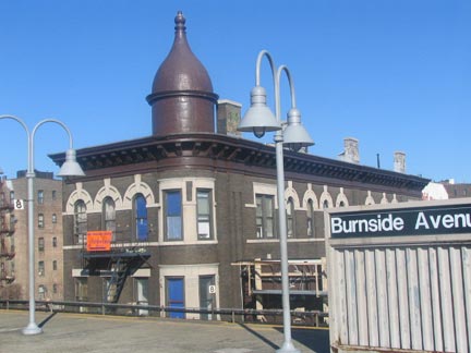
Beginning in the 1990s the MTA began using these goose-necked posts in many elevated stations, such as Burnside Avenue on the IRT Woodlawn.
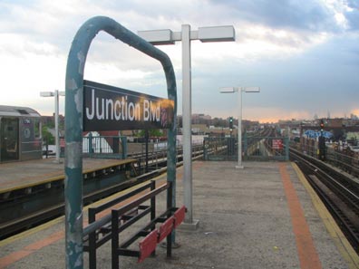
When the IRT Flushing Line gets cookin’, you have a quick ride home, with the only express stations being 61st/Woodside, Junction Blvd. and Willets Point Blvd. The Junction Blvd. sign stanchion and lamps are typical on the line’s express stations. The name of the street is thought to reflect its location near a cluster of horsecar or streetcar lines, but no one is quite sure.


Parkchester on the IRT Pelham Bay Line. Second-generation platform stanchions, likely dating to the 1950s. These unintentionally copy standard-issue street lampposts with their gently bent masts.


The IND doesn’t get much of a chance to strut its platform-lighting stuff: all but two of its stations are underground. Here at the 8th Avenue Line’s 190th Street station, though, there’s a walkway to Fort Washington Avenue, and a tantalizing glimpse of what the outdoor el lamps would look like if the IND had gotten an opportunity to build el stations, as might have happened if the IND Second System was built; the Depression and WWII ended the plans.
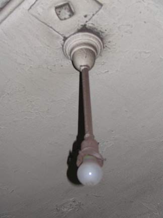
Prior to the late 1980s, some stations (especially on the IND Fulton Street line) were still illuminated by dim incandescent lamps. Most stations in the subway system still present evidence of the dim past; here’s an incandescent lamp fixture at Vernon-Jackson on the IRT Flushing line. [since removed]
The tunnel the line uses to enter Queens was originally built by piano maufacturer William Steinway as a trolley tunnel. One overhead third-rail bracket from the trolley car days still remains in public view: it can be seen at the center of the Vernon-Jackson station on the ceiling on the Queens-bound side, according to Electric Railroads magazine.
Sources:
Subway Style, NY Transit Museum, Stewart, Tabori and Chang 2004
BUY this book at Amazon.COM
Subway Ceramics, Lee Stookey, self published 1994
BUY this book at Amazon.COM
11/14/05