There’s an entire subculture of people who follow trains around or are fascinated by them. In England, they’re called “trainspotters” and here in NYC, there are a group of rabid fans that are known even among themselves as “foamers.” They know how to recognize every piece of “equipment” in the system. Your webmaster is not quite that involved. I have a great enthusiasm for the NYC subway system, I praise its strengths and am frustrated by its drawbacks, but my Saturdays are not spent riding every line, just for the ride.
I have previously on FNY alluded to my job in the 1980s at Photo-Lettering, then the biggest type shop in the city (type shops were swept away by the rise in digitized fonts) and, my fascination with type and graphics has carried over to my many pages on subway signs, and I feel the pull to do them even now. ForgottenFans always send me pictures of either what they’re finding in the subways…maybe one of the new black and white standardized signs has been taken down, exposing a sign from a previous era…or photos of what the MTA has forgotten to replace. On this page we’ll show just a few of the old signs I’ve been sent lately.
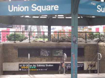
Union Square East at East 15th Street: on the kiosk’d entrance we see some classic blue, green and white-enameled signs. These were standard issue in the system from I’d say the 1910s or 20s right through the early 1980s, when the MTA decided to standardize all signage with black and white signs and Helvetica type, seen beneath. Early on subway signs were quite prolix: just about every possible destination and every transfer was listed on the sign. Here, the IRT is marked on the blue and white sign, with the BMT Canarsie, the 14th Street Line, in green and white. They have been uncovered temporarily and will soon return to sign heaven.
Also note the TA, then the MTA, had a fascination for a time with Standard Medium. Introduced by Massimo Vignelli’s Unimark International design firm, the Helvetica-esque typefont on the kiosk was used from the 1960s into the 1980s, when it was replaced with the ubiquitous real McCoy. Slate Magazine uses Standard, or a similar font, Akzidenz Grotesk, for their logotype. photos: Don Brunjes
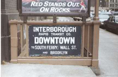
Art direction in the early years of the subways, from the end of the initial Beaux-Arts Heins and LaFarge era well into the 1940s, was overseen by artist/engineer Squire Vickers. It was he who mandated cobalt blue for IRT (Interborough Rapid Transit) and green for BMT (Brooklyn-Manhattan Transit). These two rail lines were owned and operated by separate companies until they were merged with the City’s Independent Rapid transit (IND) in 1940.
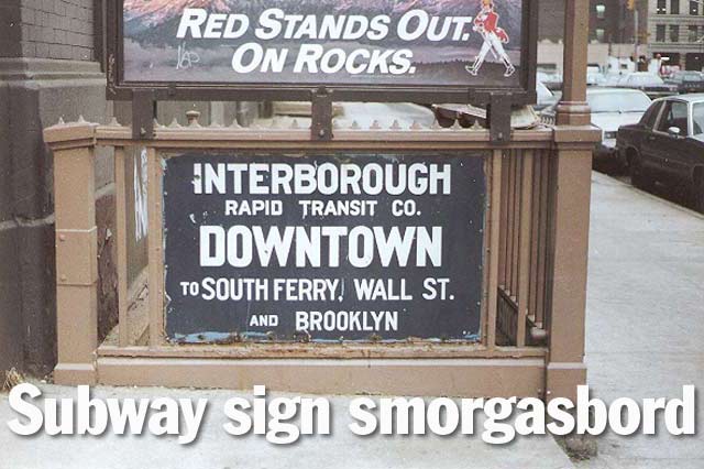
The sign at left was likely located on a Lexington Avenue line (4,5,6) station, since it points to South Ferry, Wall Street and Brooklyn; South Ferry has a loop track that allows southbound trains on the Lex to enter South Ferry via Bowling Green. It is mostly unused these days except in reroutings. photo: Bob Mulero
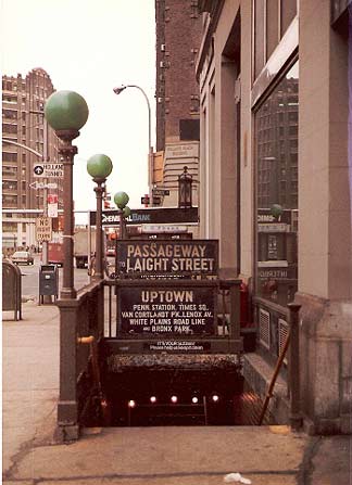
There’s an awful lot to take in here. These are 1920s-style IRT blue and white signs, and while the original idea was to give the passenger as much information as possible…by the 1970s, streamlining was the rage, and signage began to follow the Keep it Simple, Stupid policy.
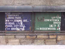
We are on Canal Street just west of 6th Avenue, but this entrance leads to the IRT 7th Avenue line (the local #1 stops here). North of here, there are connections to the #2, which runs to Van Cortlandt Park, Lenox Avenue, the White Plains Road el, and Bronx Park at East 180th Street.
It’s after 1981 or 1982. We know this because green entrance globes are posted at the station. Prior to that, octagonal entrance lamps and later, white squares bearing the “TA” Transit Authority logo were used.
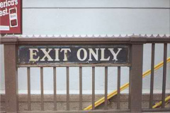
Thereafter, a station entrance color coded system was introduced that featured green for entrances open 24/7, red for exits only, and yellow for entrances open part of the time. Of late, the globes have been white with colored “caps.”
In the rear, we see a Chemical Bank sign, with its 1980s-style logo. Chemical acquired Manufacturers Hanover (or “Handover” as Ralph Kiner was in the habit of saying during voice-overs in Met games), in 1992, and then Chase in 1996, whose name it assumed.
photo: Bob Mulero
An old-style white one-way sign is on a pole at left. These were rare in the 1980s, and are quite rare now.
Needless to say the “passageway to Laight Street,” convenient as it was, crossing 6th Avenue, has been closed for years.
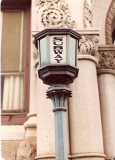
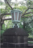
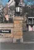
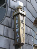
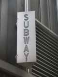
Leave a light on. At left we see a classic octagonal entrance lamp, with “SUBWAY” inscribed vertically. These disappeared for the most part in the 1960s, but a quadruplet have been restored and installed at the Montague and Clinton Street entrance to the BMT Court Street station. And look at the fluted pole! Will we ever see such design extravagance again? At right, parks have given designers and architects some rein to run free, and interesting entrance lamps can be found at Central Park South (center) and Union Square (right.) photos: Bob Mulero
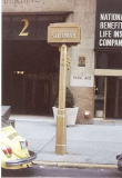
A trio of Streamline-Moderne station indicators in various states of repair. Only the center, at the IRT Fulton Street station at William Street, is extant today. The one at left stood at #2 Park Avenue just north of East 32nd Street. Note the pair of signs behind it: a Public Shelter and Fallout Shelter sign. There are still hundreds of Fallout Shelter signs on buildings around town. Oh, for the days when we knew we would be alright if we just stayed underground for a few weeks after those damned Russkies dropped an H-Bomb. Duck and cover.
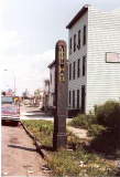
At right, Jackson Avenue, Long Island City, likely in the 1980s. This likely marked the 21st-Van Alst Avenue station, which, by 2006, has become almost comically decrepit, just like the sign was.
What a wonderful photo it is. Really…it shows the sometimes contemptuous indifference New York City, and its residents, have for public installations. The glass is broken, and it’s in the end stages of rust. Does it deserve any built-in respect simply because the city put it there as a marker? I’d say yes, but most of the city’s residents would say no. What I’m getting at is, most structures in the city would have their windows blown out and would be covered in graffiti if there were not authorities backed with the power of the police and the courts to keep them from that condition. There’s a lot of anger and contempt out there; I suppose I should feel grateful that it’s expressed this way and without violence.
Case in point: a small house, supposed to be used as a waiting area, is on the eastbound platform of the Broadway LIRR station, my local one. It was formerly open, with no door. So it was covered in graffiti and smelled of piss. Subsequently the city cleaned it but installed plexiglass windows and a locked wooden door, so the insides are protected. Yet, the outside fills in with scrawlings, the LIRR swabs cleaning fluid, the graffiti reappears, and the dance goes on and on. The LIRR would be better off razing the structure.
OK, I’m in gasbag mode. Its like that Monty Python sketch where a colonel got a little too windy, and a hammer would come down from the rafters and knock him in the head. Back to the pictures. photos l. and r.: Bob Mulero
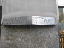
There can be nonstandard subway entrance signs when subway egress is beneath a building, and the owner marks it using his own method. These two metallic signs are on Park Avenue S. and East 23rd St., and William near Fulton.photos: Bob Mulero
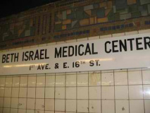
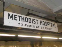
As a rule the MTA replaces nonstandard signage, but there are still a few dozen of these enamel-coated, black on white lettered signs around town. Local landmarks signs being installed today generaly employ a grey background with white lettering. LEFT: 1st Avenue station, BMT 14th Street-Canarsie Line (L) and RIGHT, 7th Avenue station, 6th Ave-Culver (F).
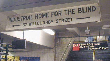
Outdated sign at Jay Street (A, F lines) for Helen Keller Services for the Blind, named for the famed author and lecturer (1880-1968) who lost her sight and hearing before age two. The institution changed its name in 1985, and Lawrence Street, above the station, is named Helen Keller Way.
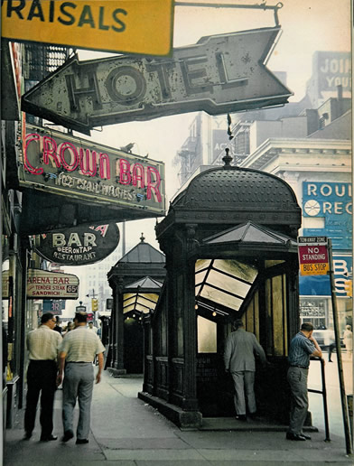
The neon signs at Broadway and West 50th Street in this photo ca. 1968-69 are not part of the subway sign canon, but attest to the richness of NYC’s neon sign heritage and cacophonous midtown. In this small picture alone, I count fourteen separate signs (including one for Morris Levy’s Roulette Records, which I knew primarily from Tommy James and the Shondells). These were among the last of the IRT’s original entrance and exit kiosks, first installed in 1904 along this route. Soon they would disappear. In the distance you can make out another subway entrance sign.
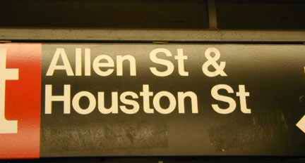
Allan Houston‘s tenure with the Knicks was marked by one trip to the NBA Finals and a lot of knee problems, but he’s remembered at Houston Street…
(I know he spells it with an ‘a’) and in NYC…it’s “HOWS-ton”…
12/16/06

