NYC’s Department of Transportation is gradually — very gradually — replacing its street signs, as many of them go back to the 1980s and are quite sun-bleached (though it seems to be that the worst sun-bleached signs are the last to be replaced!)
Beginning in 2004, new signs using a font called Clearview, designed by Donald Meeker and James Montalbano of Meeker and Associates were installed on NYC streets and street signs began appearing with initial caps but otherwise lower case. Federal officials determined that Clearview in upper and lower case was easier for drivers to read than older signs in Highway Gothic and all caps.
However, again citing safety concerns (as well as the expense of installing new fonts on workstations) the Feds about faced in early 2016, returning Highway Gothic to its rightful place of pre-eminence on street signs. Meeker reacted with anger to the news his font was being dropped, saying: ‘It’s unfortunate. It’s a shock. This is a big deal. They don’t understand design.’ [Daily Mail UK]
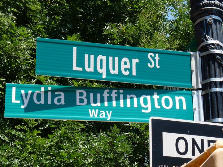
However, the newest signs don’t use Highway Gothic in the same way as the old signs did. Lowercase is retained: A bolder, condensed version is used as on the Luquer Street sign above (and the lowercase version of “q” in Highway Gothic looks like a “g”)
The contrast between the Luquer Street sign in Highway Gothic and the Lydia Buffington sign (commemorating a recently deceased Carroll Gardens community activist) in Clearview is obvious; Clearview has much thinner ascenders and descenders, while Highway Gothic’s are thicker.
In addition, the white stripes that used to appear on the top and bottom of the signs are absent from the newest signs.
Vast stretches of NYC streets, including just about all of the Bronx, have already been kitted out with Clearview, but hereon, new replacement signs will likely look like this one: condensed upper and lowercase Highway Gothic.
Meanwhile, the spelling and pronunciation of Luquer Street have long been disputed.
12/19/16

