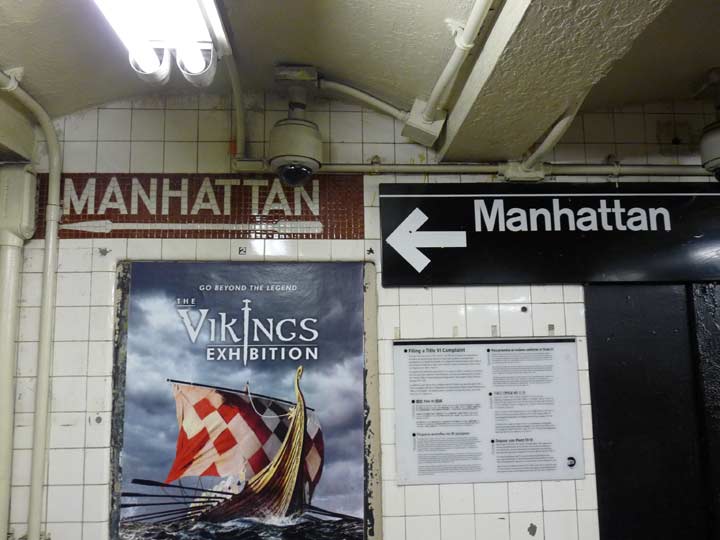
The state’s Metropolitan Transit Authority and its city cousin the Department of Transportation love to spend hundreds of thousands of dollars, some of the $$$$ generated from taxes, on signage. I found this illustrative example at the Fort Hamilton Parkway station serving the F and G trains. The one on the left first appeared in the 1930s, when the city was building the Independent Subway, an agency meant at first to compete with the privately owned Interborough and Brooklyn-Manhattan. The branches were combined into one city agency in 1940.
In the 1970s, the city hired designer Massimo Vignelli and Unimark International to standardize subway signage. Gradually, over the next 20 years, the mishmosh of subway signage in different fonts and colors disappeared, and black and white signs with sanserif fonts replaced them. At first, Helvetica was unavailable for the signs, so Unimark turned to its German cousin, Akzidenz Grotesk, also known as Standard. Many of the Standard signs remain, and the MTA sign shop still uses the font occasionally, but the MTA eventually made black signs with white Helvetica type the norm in the subways.
Here, though, the IND signage is built into the wall, and so to continue the all-important standardization program, the MTA simply installed a black and white sign and juxtaposed it with the old IND tiled sign, making the result look unintentionally comical. (It can’t go over the old sign, because advertising needs the space.) Bureaucracy at its best!
Speaking of comedy, Governor Andrew Cuomo, the ostensible head of the MTA, decreed in August 2017 that X-shaped tile designs in the Times Square station be covered with stickers resembling the surrounding tiles, in a frenzy of revanchism over its vague likeness to the flag of the Confederate States of America.
Check out the ForgottenBook, take a look at the gift shop, and as always, “comment…as you see fit.”
8/24/17
3 comments
This is my stop, I’ve never noticed this before. I’ll have to check it out next time I’m down there.
We should be thankful that the original sign was not removed, as is often done.
It,s funny they can sometimes be cheap and sometimes not. For Forest Hills, they just slapped an M sticker over the old V logo. In some places, the sticker has peeled off and you can see the old V logo as well as the old R logo when it was 5 lines which they just put a black sticker over