
A bit short on time today, so I thought I would do a short item on the unique Flushing Meadows-Corona Park signage, which uses different fonts than other fonts used by Parks or the Department of Transportation, which use Highway Gothic, Clearview, and Palatino (on the brown Parks signs, with the leaf).
At Flushing Meadows, the leaf motif (hey, that rhymes) is retained, but the rather heavy Plantin Bold Condensed is used on many signs. This is the font formerly used on the “wood” headers in the classic Village Voice of the 1970s.
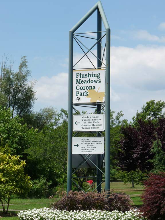
Other stanchions employ the classic Bookman font, but it’s the International Type Corporation Bookman developed in the 1970s with its large x-heights.
30 years working in the type biz has given me an enthusiasm for fonts, and it comes into play when noticing NYC signage everywhere I go!
Please help contribute to a new Forgotten NY website
Check out the ForgottenBook, take a look at the gift shop, and as always, “comment…as you see fit.”
11/28/18
1 comment
The leaf is that of a sycamore, which along with the very similar London plane tree is one of the most common city street and park trees.