As Forgotten NY fans know by now, I’m fascinated with New York City’s infrastructure and despite the subway’s overall failings, I’ve always had a soft spot for subway infrastructure; I leave the politics and policy matters to Second Avenue Sagas (which recently profiled subway mapmaker Eddie Jabbour) — all that is beyond my pay grade and understanding. Regarding myself, if I like the way something looks, I’ll aim the camera at it.
I do have a soft spot for modernism — it has its moments especially with the new subway stations that have come online over the last decade such as the Second Avenue Q train extension; the new Hudson Yards #7 train station (seen on this FNY page); and revamps of the Astoria Elevated stations.
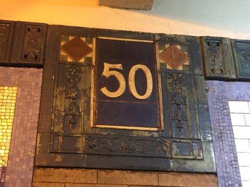
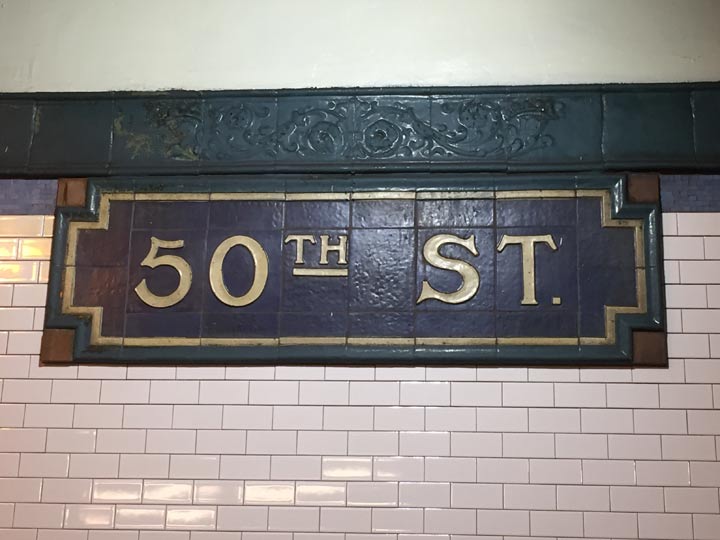
Make no mistake, though, I’m most fascinated with the terra cotta, tile and mosaic stylings of the subway’s very early days as seen in the Original 28 stations opened on October 27, 1904 and designed by Heins & LaFarge. I’ve also been doubly fascinated by the stations featuring a wealth of terra cotta that include Astor Place, 50th Street and 66th Street and originally, Columbus Circle. Take look at the huge station ID plaque shown above that consists of a number of ceramic plaques, manufactured by Grueby Faience, attached to each other. This specific lettering appears, or appeared, only at the stations I just listed.

What’s to stop modern designers from making subway stations like this these days? Nothing, apparently, but fashion and cost. Most modern stations built in 2019 are bland white walls upon which are hung the MTA’s present-day black and white signage. The 2nd Avenue stations, seen at the above link, employed different artists to curate each station. Imagine had the IRT done this in 1904, the legendary names that could have been hired. But Heins & LaFarge did well enough on their own.
Both Lee Stookey and Phil Copp give the 50th Street station short shrift in their respective Subway Ceramics and Silver Connections Vol. 1 editions; Stookey, in fact, doesn’t cover 50th Street at all. Thus, I’m happy to step in and fill the breach somewhat here.
The news isn’t totally good at 50th Street, which serves the #1 train. Just a couple of the faience plaques remain; the rest have been replaced by colored tilework that, while giving it the ole college try, can’t match what was there originally.

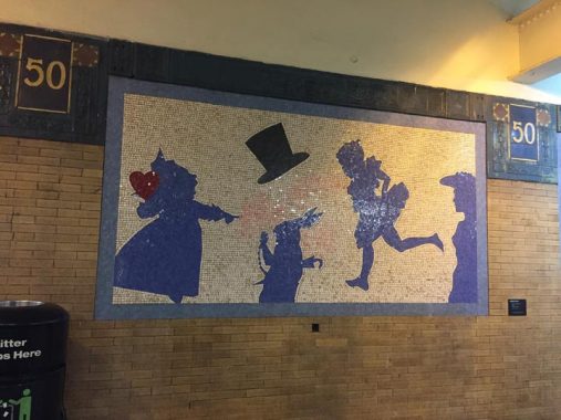
I’m unsure what connection British fantasist Lewis Carroll has to do with 50th Street, but mosaic installations by Liliana Porter installed in 1994 feature “Alice in Wonderland” characters: the Queen of Hearts, Alice, the Rabbit, and the Mad Hatter.
Check out the ForgottenBook, take a look at the gift shop, and as always, “comment…as you see fit.”
12/26/19


6 comments
How long will the Alice In Wonderland mosaic last now that NYC has fallen down the urban decay rabbit hole again?:
https://nypost.com/2019/12/26/queens-pol-blames-de-blasio-for-subway-graffiti-hot-spot-in-his-district/
Not relevant to this article. Go troll somewhere else.
Kevin, is there some way to block this person from commenting?
You really need to calm down; a visit to the office of Dr. Martin Abend (deceased) is in order & will do you a world of good. Best of Luck, & a Very Happy New Year to you & Yours.
In the late fifties and early sixties, a number of IRT station platforms were lengthened to accommodate ten car trains. 50th Street-Broadway was one such station, as its original platforms could only handle five cars. The extensions were done in a bland, locker-room style with mostly white tiles and a light brown band with the station name. On the #1 line, 59th, 66th, 79th, and 86th Street station platforms were extended using that style. Today, portions of the 59th, 79th, and 86th Street platforms still exhibit that style.
I believe the use of the Alice in Wonderland characters is related somehow to the nearby Broadway theaters, as well as the fact that Alice was underground during her adventures.
MTA’s description of why Alice at 50th Street, FWIW:
“50th Street
LILIANA PORTER
Alice: The Way Out, 1994
Glass mosaic on platform walls
In this series of mosaic panels, titled Alice: The Way Out, Liliana Porter’s silhouetted figures portray characters from Lewis Carroll’s Alice in Wonderland. The simple and engaging quality of the works echo the stagecraft found in the Broadway theaters nearby. The artist evokes the idea of the theatrical and playfully connects it with the experience of being underground, as was Alice during her adventures. Commenting on what is below the surface, Porter shows Alice pulling back a curtain to reveal the drama. Porter prefers to let the viewer’s imagination fill in the details of her shadowy figures, playing on our varying views of reality while entertaining her captive audience.”
http://web.mta.info/mta/aft/permanentart/permart.html?agency=nyct&line=1&artist=1&station=11