

I haven’t been on the subways and trains as often as I was prior to 2020. My fascination hasn’t ended, but at first I stayed away while the Pandemic was raging and now I stay away (though not completely away) as subway incidents and crimes have ratcheted up the past few years, as has street crime. I am a lot more wary than I used to be, and eagerly await the day when I can again enter any NYC neighborhood or subway line with a camera, bold as brass, and walk where I please. Those days do not seem to be returning soon, as trends tend to last for decades.
I do not classify myself with most subway fanboys or “foamers” as their detractors have it. I do not attend every running of classic trains, though I did show up at one in Brighton Beach in September 2022 and hope to make it to the weekend Christmas season specials if they return this year. I do, though, readily admit I am a sign and type geek. I have worked with printed words my entire career, as a proofreader, typesetter (when that was a thing), copywriter, editor and on computer page layout. I have memorized type font names (though not the latest ones). Whenever I enter a subway station I am keenly aware of the signage. I can even tell Helvetica apart from Standard.
That’s why I lapped up the subway signage exhibit held in the summer of 2019 at the Transit Museum branch in Grand Central Terminal, which is open Tuesday through Saturday…

Before entering the museum I noticed that GCT had replaced its train schedule “flippy boards” with an LED design. I lamented their passage in Penn Station several years earlier. Easier to change, apparently, and less moving parts calls for less necessary maintenance.
As I write this it’s only a couple of months until Long Island Rail Road trains enter GCT via a new tunnel (that completes a tunnel that actually began excavation in the 1970s) and a station in a new underground level. These boards already look pretty full, so room will have to be made for all the extra trains.
Many years ago, GCT handled intercontinental train service until it was flipped to Penn in the 1990s (Andy Sparberg, the floor is yours in Comments).

This brass subway entrance sign decorated with sea horses was mounted on an entrance at the Greybar Building, Lexington Avenue and East 43rd Street, a building that serves as an entryway to CGT and features artwork depicting sea life.
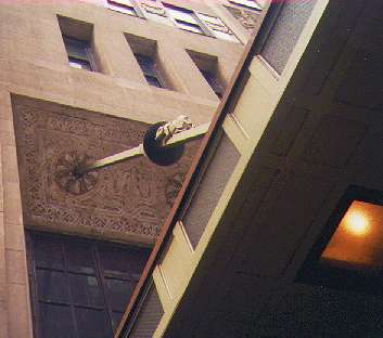
Above one of the entrances at 43rd Street, a handsome canopy protects people waiting for taxicabs. But what are those bumps on the struts holding the marquee in place? Those aren’t bumps–those are rats! What in the world are carved rats doing on a NYC building: haven’t we got enough real ones? A close look will also reveal eight rats’ heads surrounding each hawser (the lines holding the canopy) as they reach the Graybar Building.
The Graybar was originally named the Eastern Offices Building. It was designed by the architectural firm of Sloan and Robertson and opened in 1927, at the height of the Art Deco period, and the building was designed with a lighthearted feel. Major tenants in the mid-2000s included the Metro-North Railroad, Bank Leumi, New York Life Insurance, and Smithsonian Magazine.
Why the external myomorphic theme, then? Neighboring Grand Central as it does, the Graybar’s architects wanted to emphasize NYC’s status as a great port, and chose to use rats, so often found on sailing ships of yore, to symbolize a maritime theme. Albatrosses also show up in the ornamentation, and formerly, the building’s elaborate signs above subway entrances sported seahorses.
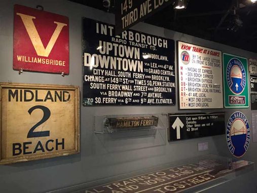
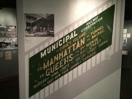
In this display, the sign upper left was used on a Bronx trolley line. In Manhattan and Bronx, trolley lines bore letters as do modern IND and BMT subways.
Before subway maps were commonplace, you needed to find out about connections and transfers, which could be complicated, from enamel signs such as these. This sign was located in the Bronx and directed passenger toward today’s #2, 4, 5 and 6 trains, as well as the 6th and 9th Avenue els (which ended service in 1938 and 1940).
Lower left: I am not well versed on Staten Island’s trolley lines, but this one ran in Midland Beach, a south shore neighborhood.
Some long ago trolley lines identified routes by turnable wooden blocks. “Hamilton Ferry” was likely the north end of Hamilton Avenue in Brooklyn, by Upper New York Bay.
Older BMT line designations, as well as the handsome 1960s Transit Authority logo, are seen on this sign; since 1978, BMT and IND lines have been identified by single letters.
On the right are two versions of traffic signs directing autos to routes connecting to the Verrazzano-Narrows Bridge (I do not know why they were included in a subway signs exhibit, though).
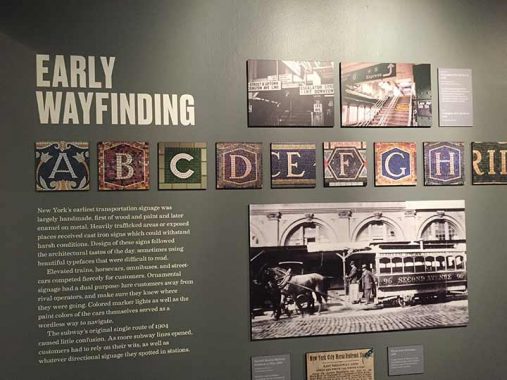
I often complain about the MTA’s as well as the NYC Department of Transportation’s predilection to eliminate nonstandard signage. Practicality, though, has forced the MTA to largely leave in place the early terracotta station signage (1904-1908), mosaics (1908-1928) and tilework signs (1933-1950) and in fact, The MTA restored the former tilework on the BMT 4th Avenue-Broadway line that had been covered up from 1970 into the 2000s.
When artist/architect Squire Vickers (1872–1947), a painter by previous trade, took over the subways’ art direction with the BMT Dual Contracts of the 1910s, he was forced by more modest budgets to switch from the Beaux Arts sculptures and tablets favored by original subway designers Heins & LaFarge and employ tilework and mosaics in BMT and IRT stations built between 1911 (with the “Dual Contracts” funding Brooklyn Rapid Transit and later the BMT, and the IRT). The adaptable Vickers also designed the more austere IND stations built in the 1930s through 1950. Most subway artwork from the 1910s through the 1930s is attributable to his efforts; NYC’s subways have a richness in station decoration that is vastly superior to any other system in North America. The process is still ongoing, with the MTA’s Arts in Transit program continuing to beautify stations today.
The renowned ceramic tile firms of the early 20th Century were employed to create ID and directional signs in the subway in the early era from 1904 to 1908: Rookwood Pottery, Grueby Faience, and Atlantic Terra Cotta.


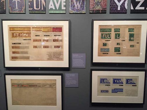
Here’s some original plans for the colored station ID tablets employed by the IND beginning in 1930. IND stations employ just one color (with perhaps lighter or darker shades for contrast). I’ve been able to acquire and reproduce the fonts employed on BMT/IND stations, which have been meticulously rendered by modern-day designers, but the main IND font, which is distinctive, has eluded me. It’s possible the main IND font, along with the serifed black directional sign font, may have been designed by Vickers himself.
IND stations feature the same color along local stations, and change color at express stations. Just about every major color in the modern spectrum can be found somewhere in the IND stations built in the 1930s and 1940s.
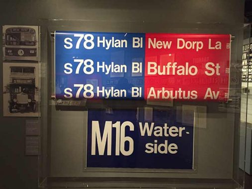
The signs on top were familiar to riders in the GM and Flxible buses in the 1960s and 1970s, which were known as “fishbowls” because of their huge front windows. I remember them more because sometimes the windows would come loose at the bottom and flap when the buses took a turn. Opening them was a pain, too, because you needed to push a button and pull at the same time. (I haven’t encountered the sign on the bottom; fill me in in Comments.)
Slanted signs, used on staircase railings on elevated lines, were relatively rare. This one was probably located on the Astoria Line, which ran RR trains until 1987 when the N was switched over. White IRT ceramic signs were navy blue, the BMT’s were green.
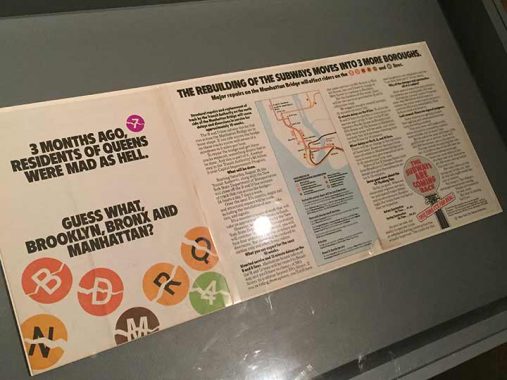
In the 1990s, the Manhattan Bridge subway tracks underwent extensive repairs that, at one point, split the bridge’s IND lines, the B, Q and D, into two separate services, one in Brooklyn, the other in Manhattan; and the N had to run over R local tracks between the boroughs. It had turned out to be a mistake to place two subway lines on the Manhattan’ Bridge’s outside edge when subways started using it in the 1910s, because the trains running there caused torque that gradually twisted the tracks, creating a dangerous situation. It took nearly a decade of repair to conquer the problem.
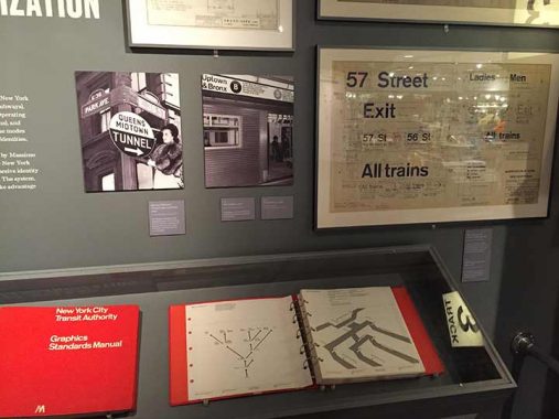
A look at the Transit Authority Graphics and Standards Manual, which is for sale if you want to cough up over $100. Admittedly, subway signage was a hodgepodge of inconsistency until Unimark, a design agency helmed by Bob Noorda and Massimo Vignelli, attempted to unify the system by employing white signs with the Standard type font. The system has evolved over time and today signage is black with white Helvetica type.
In recent years the MTA has been fairly relentless in rooting out nonstandard signage, as has been the department of Transportation.
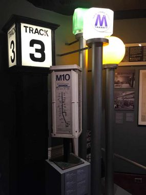
The Track 3 indicator was in use for many years at the Flatbush Avenue Long Island RR terminal.
The boxy bus route indicators can still be seen at bus stops, but finding schedules now requires riders to use a smartphone app; this saves the MTA the work reposting printed schedules whenever they change, which is fairly frequently. Don’t have a smartphone? The bus comes when it comes.
On the right are subway station indicators with the old two tone MTA “M” which can still be seen fairly frequently. While red and green globes indicate stations open for entry or are exit-only, the MTA long ago retired the yellow, which meant the station can be entered part-time.
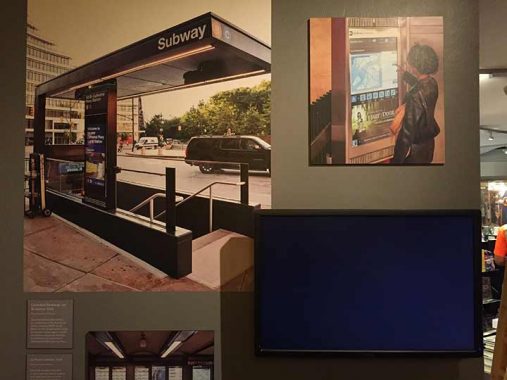
The MTA has two separate new entrance kiosk designs, one an oblong, glassy canopy in use on the new 2nd Avenue uptown extension, and this black rectangular one that is popping up in various locations but first appeared on the 4th Avenue BMT in Brooklyn in 2017. This one is located at the 110th Street A/C station uptown.
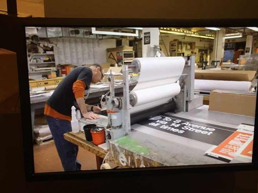
A depiction of the Bergen Street Sign Shop in Brooklyn, which produces all the ID and directional signs used in the subways, buses and ferries. I’m in my 60s now, but if I was a few decades younger, I’d try to angle my way into a job there. I’d be like the kid in the candy store. (I gave up candy.)
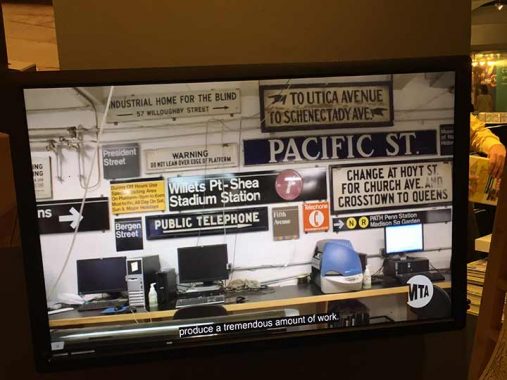
A Sign Shop wall depicts past and present sign designs. The black signs, with a change to Helvetica, represent signs that are produced today.
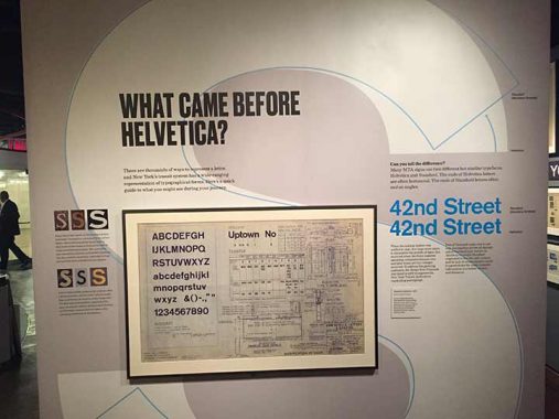
A trained eye can tell apart Standard and Helvetica, but the differences were enumerated here.
As always, “comment…as you see fit.” I earn a small payment when you click on any ad on the site.
10/9/22
18 comments
Transcontinental, not intercontinental. I don’t recall any service to Eurasia, Africa, Australia or South America.
You’re forgetting the 11:14 express to Antarctica.
The Waterside is an apartment complex on the east side of Manhattan between East 25th and East 28th street. It is on the East River side of the FDR. It has 4 high rise buildings (3 private rental and one subsidized public housing). I would take that bus to my job at 1 Penn plaza on West 34th street, in the early 80’s in the AM and walk home (weather permitting) in the PM when I lived there.
Kevin, were you actually a “type setter” (ie. Using a California job case)? At Montauk JHS in Brooklyn, print shop consisted of teaching us how to pick the individual letters out of the job case and load them into a composing tray. How tedious and time consuming! And this was 1960! I don’t know how a newspaper like The Times ever got printed. It must have taken armies of type setters. Once we inked and printed the composing tray for the teacher to grade, we had to replace the type back into the job case. You can imagine how that went!
Phototype, which means entering lengthy lines of code if you wanted italics, Bold etc
Bill, composing type by hand was only one of several methods of typesetting and was usually employed for smaller print jobs. Starting in the late 19th century through much of the 20th century, newspapers utilized a hot metal type composing method using ludlow and linotype machines. By the 1970s-80s, photo and digital type composition replaced these methods. See:
https://en.m.wikipedia.org/wiki/Linotype_machine
The NY Times would never have been published if it’s text had to be composed with hand-set individual type slugs. The Mergenthaler linotype machine was the solution. Google linotype for particulars.
I finally got to show up for the parade of trains both days in September! I was in Brooklyn catsitting for a friend. Didn’t get to see you though!
I can remember when they were still a lot of signs with hands pointing the direction to
go in but theyre all gone now.I guess arrows took over that job..
The rats going up the mooring lines on the Graybar building are being stopped by cone
shaped metal rat guards but I havent seen a rat guard installed on a ship’s line in years.
I guess today’s rats dont bother stowing away on ships anymore.They must all go
by air these days.
Transit Museum used to run tours of the sign shop…really fascinating.
The M16 Waterside style of sign was used on the sides of the Bus-O-Rama buses (AKA Batwing buses). They were Fishbowls with advertising along the upper sides of the bus. The center sign on the sides was for the route and destination of the bus.
“A trained eye can tell apart Standard and Helvetica, but the differences were enumerated here.”
But the explanation in the image is too small to read! So what does it say, and what are the differences?
Look at the S for each
Great article Kev.
Hi Kevin, Andy Sparberg here. Amtrak long distance trains stopped using Grand Central in 1991, when all intercity trains out of NYC were consolidated at Penn Station. There have been some temporary Amtrak incursions back to GCT in the ensuing 31 years, but only when track work at Penn restricted capacity there. Keep in mind that since the 1970s Amtrak;s only services in and out GCT were to upstate NY and Canada (Empire Service). Even then, the majority of NYC intercity trains used Penn Station because of its location on the Northeast Corridor.
Kevin, a few more comments, if I may, about some of the photos in this excellent photo essay.
First, at the top you note that “I write this it’s only a couple of months until Long Island Rail Road trains enter Penn Station via a new tunnel (that completes a tunnel that actually began excavation in the 1960s) and a station in a new underground level. These boards already look pretty full, so room will have to be made for all the extra trains.” I think you mean that LIRR trains will enter Grand Central, not Penn, via a new tunnel. Planning began in the late 1960s and tunnel construction actually began in 1971. LIRR train times will not be displayed where the photo was taken, but rather in a new LIRR concourse located adjacent to the dining area near the second level Metro North tracks (higher number tracks). That concourse will have high speed escalators connecting with the two-level LIRR track caverns 100 – 140 feet below.
Second, the large bus sign that says “M16 Waterside” looks like it’s from a Bus-O-Rama route sign that was along the roof line of GMC buses purchased between 1965 and 1969. These were large rectangular signs with backlit ads on either side of the route sign.
Third, the green BMT elevated is likely not from the Astoria Line – it looks like it’s from the West End line (today’s D train) from a station between Fort Hamilton Parkway and Bay 50th Street, inclusive. The directions refer to directions – southbound to Coney Island, and northbound to Manhattan via either the Montague Tunnel or Manhattan Bridge, with a multitude of transfers. Ultimately northbound West End trains ended up in Queens, as noted, specifically at Queensboro Plaza. There, BMT shuttle elevated trains operated to Astoria and Flushing. Today’s route pattern, with BMT through trains to/from Astoria, and IRT through trains to/from Flushing, dates from 1949.
The Midland Beach #2 was indeed a Staten Island trolley route that later became the R2 (later the S2) bus to South/Midland Beach. It was finally renumbered the S51 when all the island’s bus routes were relabeled in the late 1980s. The route along Bay St/Sand Lane is all but unchanged since the trolley days, however.
Nice work; I really enjoyed this one! Thanks, Kevin!